
Photo by Andrew Moca on Unsplash
Inclusive and Accessible Learning Design
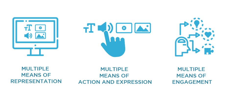
To me, inclusive design means anticipating learner variability before even knowing my student’s needs, reflecting the U.D.L. Guidelines. By incorporating multiple means of engagement, representation, action and expression, we plan learning experiences that are accessible and work for all kinds of learners (C.A.S.T., 2024). Through designing with inclusion in mind from the beginning and considering barriers that may impact learning, educators will find that an adaptation that benefits one student will likely benefit many others (Government of Canada, 2025). For example, Kouznetsova (2018), Hayman (as cited in DO-It, 2017), Bergstrom (as cited in Do-It, 2017), Wong (2023), Patel (as cited in ColumbiaLearn, 2019), and Gernsbacher (2015) state that good quality video captioning not only benefits deaf people, but it also aids when you are learning a second language, in a sound sensitive environment, or if you are struggling to understand the speakers accent or the content. Barriers should not be the reason students are not successful, as we are not assessing them on their ability to hurtle over them. By removing them, we give everyone a fair chance.
How I Will be Conscious Moving Forward
Although diversity, accessibility, and inclusion have always been very important to me, I have learned so much about how I can improve my digital content. The resources this week were truly so helpful and applicable. They also got me thinking. So far, every week in this course I have felt that the resources were relevant, the workload is doable, and I am learning much more than in any other class I’ve taken, especially online. I am starting to see how this course is designed in the exact way that each week’s resources suggest a course and its content to be designed. Therefore, I am actually seeing and feeling the positive effects myself, making designing this way much more motivating. Here are some of the tops ways my design will change based on the resources this week:
- When creating a video:
- Leave enough room on screen so captions don’t cover faces or content (DO-IT, 2017). Make sure to include a transcript and manually include closed captions that only take up one or two lines, follow proper grammar, are verbatim, a good font and contrast, synchronized with the audio, include non-speech elements, upper and lowercase letters, and describe any additional sounds (Kouznetsova, 2018 & DO-IT, 2017).
- Create an audio description option (DO-IT, 2017).
- Following Laura Wong’s (2023) Tips:
- Use custom alt-text to accurately describe images.
- Write accessible text.
- Create accessible visuals.
- Stay up to date on platform accessibility features.
- Be mindful of meme and emoji use.
- Embrace feedback.
- Provide selectable text (Cahill, 2015).
- Use premade formats, such as headings and bullet lists (Cahill, 2015).
- Emphasize text using only bold or italics, but remember that bold is best as italics can be challenging to read (Cahill, 2015).
- Provide descriptive hyperlinks with context and alt/title text (Cahill, 2015).
- When making a PowerPoint (following David J.P. Phillips (2014) advice):
- One message per slide.
- Read/explain majority of the context orally. The slide should have short summary bits of text with a supporting image if necessary.
- Keep in mind that people are drawn to moving objects, signaling colours, contrast rich objects, and big objects.
- The most important piece of information(s) should always be in the biggest font. Headings should actually be small and your content should be big.
- Dark backgrounds with white font are best.
- Never include more than six pieces of information in the presentation. The number of slides does not matter.
References
Cahill, C. (2015, February 4). Creating Accessible Text (Designing Digital Curriculum) [Video]. YouTube. https://www.youtube.com/watch?v=wz-4W3-4wog&feature=youtu.be
CAST. (2024). The UDL Guidelines. https://udlguidelines.cast.org/
ColumbiaLearn. (2019, June 24). MOOC INCLTEACH1x | What is Universal Design for Learning? [Video]. YouTube. https://www.youtube.com/watch?v=pdmoBl3Z75I
Do-It: Disabilities, Opportunities, Internetworking, and Technology. (2017). Making Videos Accessible. https://www.washington.edu/doit/videos/index.php?vid=86
Gernsbacher, M.A. (2015). Video Captions Benefit Everyone. Policy Insights Behav Brain Sci. 2015 Oct;2(1):195-202. doi: 10.1177/2372732215602130. Epub 2015 Oct 1. PMID: 28066803; PMCID: PMC5214590.
Government of Canada. (September 19, 2025). Universal Design for Learning: UDL. https://a11y.canada.ca/en/universal-design-for-learning-udl/
Open Library. (n.d.). 2.4 Universal design for learning and equitable access to online content. https://ecampusontario.pressbooks.pub/humanizinglearningonline/chapter/2-4-universal-design-for-learning-and-equitable-access-to-online-content/
TED xTalks. (2018, August 24). How captions increase ROI and audience for media creators | Svetlana Kouznetsova | TEDxFultonStreet [Video]. YouTube. https://www.youtube.com/watch?v=ngKp9MqUGj8
TED xTalks. (2014, April 14). How to avoid death By PowerPoint | David JP Phillips | TEDxStockholmSalon [Video]. YouTube. https://www.youtube.com/watch?v=Iwpi1Lm6dFo
Wong, L. (2023, April 24). Social media accessibility: Inclusive design tips for marketers. Hootsuite. https://blog.hootsuite.com/social-media-accessibility/
Leave a Reply
You must be logged in to post a comment.